Branding
“One of the leading providers of IT infrastructure and cloud services in the UK.”
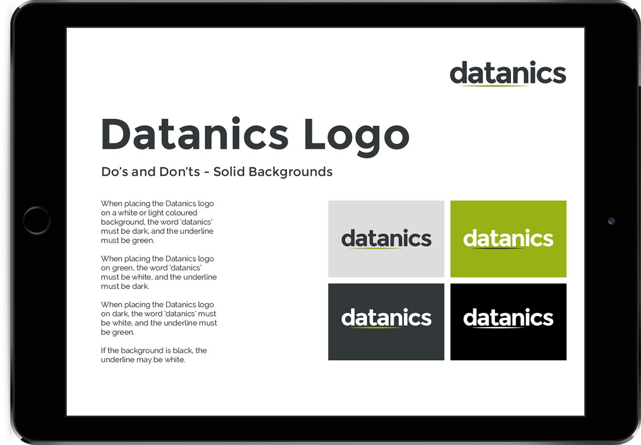
The Datanics logo uses a lowercase typeface to reflect a user-friendly service as a modern technology brand. The word Datanics is pronounced datan-ics, and the underline between the ‘d’ and the ‘n’ helps to accentuate this.
A set of Brand Guidlines have been created to maintain the companies brand consistency, and features guides on using the Logo, Backgrounds, Fonts, Colours and Icons.
WordPress Website
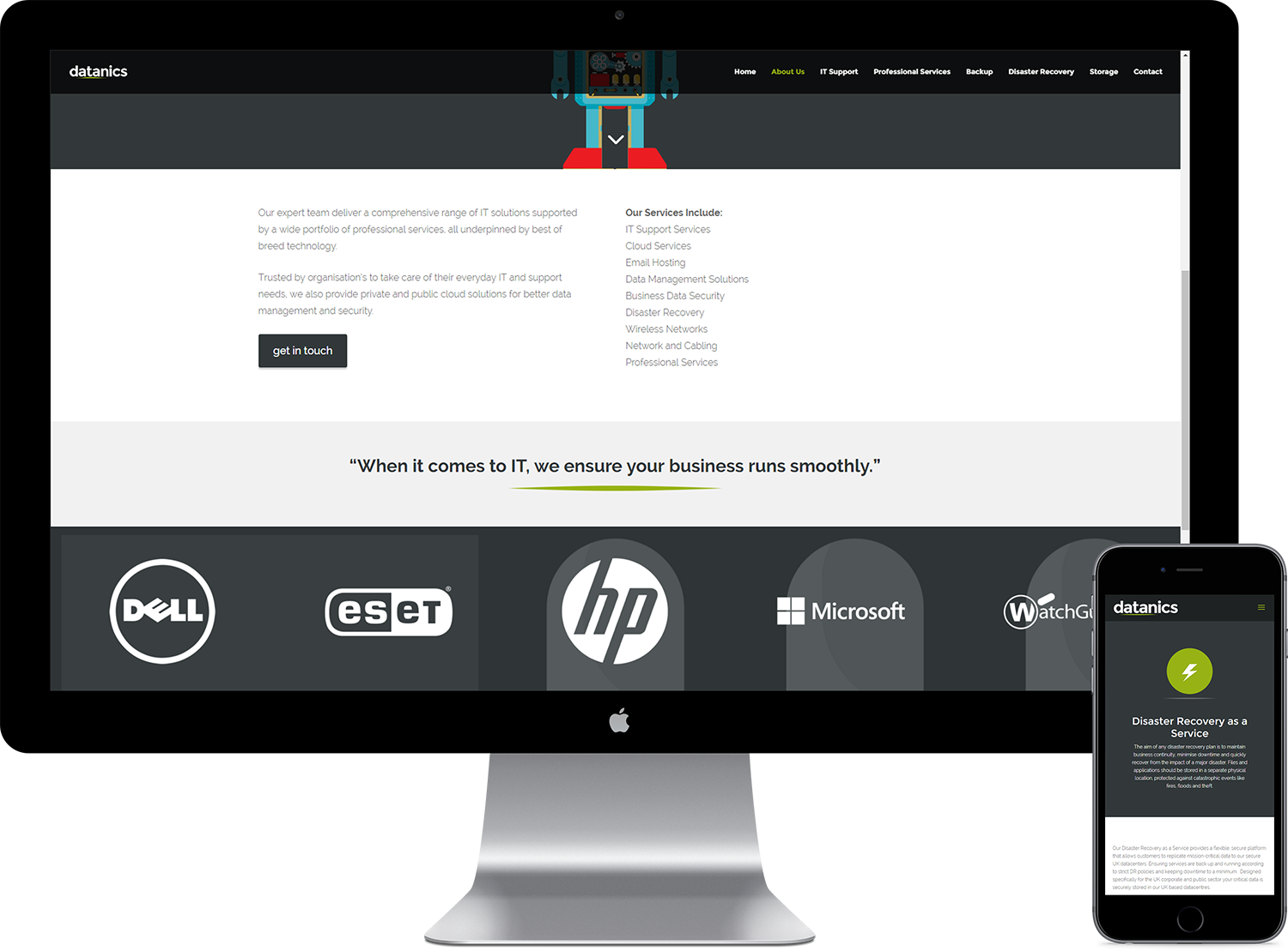
The Datanics website is small yet has an engaging interface. The design is very brand-lead, giving a well-established overall look and feel.
The theme is fully mobile and tablet responsive, and loads faster than over 80% of all speed tested websites.
Built on the WordPress framework, Datanics are able to easily update and maintain the website themselves.